
Monday, 27 February 2012

Sunday, 26 February 2012
I love museum architecture
photos via designboom
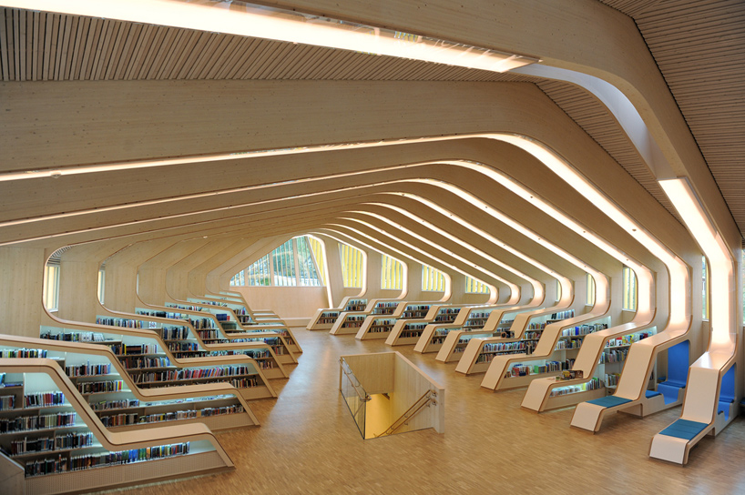
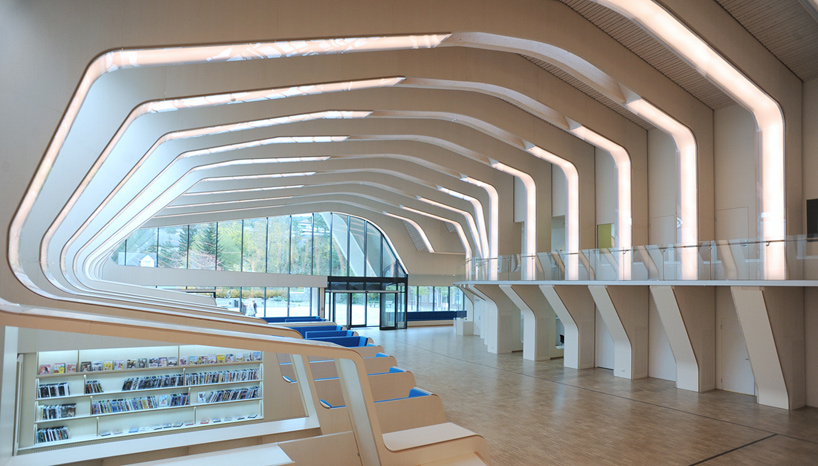
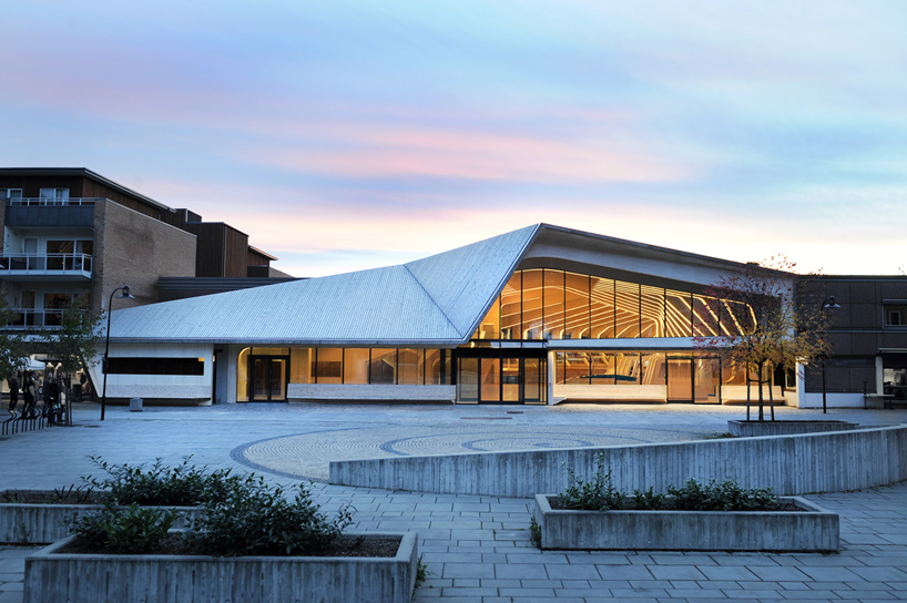
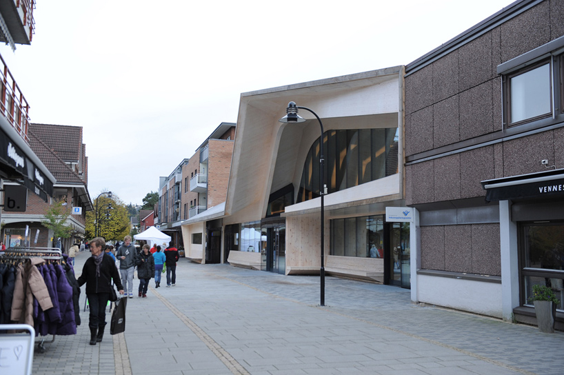
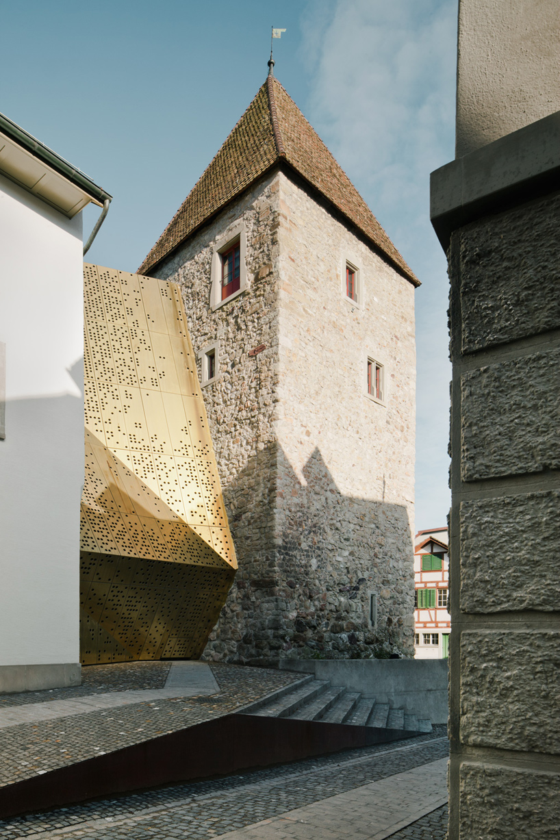
Museum Extension in Switzerland by MLZD architects.
I like how they talk about a more intuitive layout whilst using a clear public display. It's so pretty and not overtly dramatic or harsh, which it could've been with a reflective material and sharp angles. But the shallowness of the valleys and peaks means its almost soft, as well as the spattering of circles. noice. also like the cobbles.

Friday, 24 February 2012
Make It about the Function; Zmianatematu cafe and Bakery
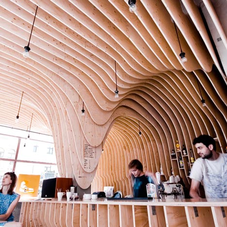
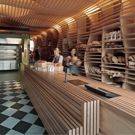
via dezeen. Both this bakery and Cafe take their product and use the main function of display to carry foward their complete aesthetic and material concept. I think its a gooda starting point and something I need to think about more in design. Could be really handy in producing consistent deisigns which don't feel like a box of parts.
Thursday, 23 February 2012
The Evelyn Grace Academy; Zaha Hadid
The brilliant Evelyn Grace Academy by Zaha Hadid. Brilliant example of simple, understated spaces for young people that works well in an urban space and is exciting at the same time. Yes I am lazy, so this is just the whole article from dezeen.
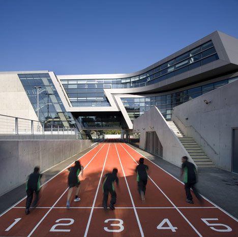
Zaha Hadid Architects have completed this school that bridges a running track in Brixton, south London.
Wow; Old Workshop by Jack Wooley
read more at http://www.dezeen.com/2012/02/22/old-workshop-by-jack-woolley/#more-194258
an almost compltly hidden door provides a 'secret' entrance to the inside of this two storey converted warehouse, with one storey submerged under the ground. A really interesting design and simple delivery. I really like this.
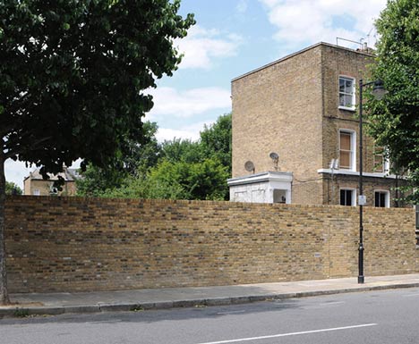
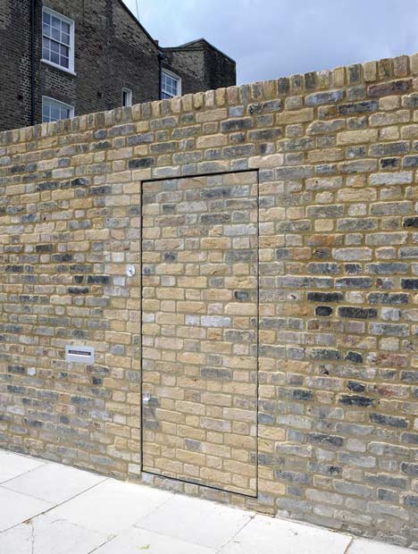
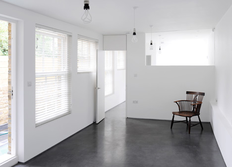
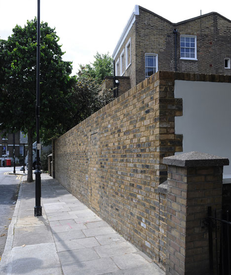
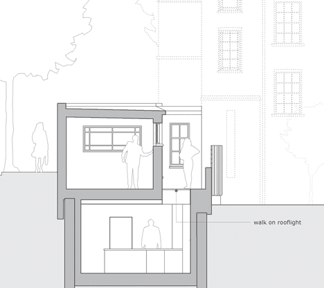
an almost compltly hidden door provides a 'secret' entrance to the inside of this two storey converted warehouse, with one storey submerged under the ground. A really interesting design and simple delivery. I really like this.
Wednesday, 22 February 2012
Tuesday, 21 February 2012


Monday, 20 February 2012
I don't like David Hockney; or how i learned to tolerate him
 |
| (above) Hockney at his best |
I don't like David Hockney. I find his work lazy and at times a bit clinical; a little bit soulless.
To me the collages are like cubism; uncomfortable pictures, with a lack of clear composition. The repeated squares from every photo created a rigid pixelated effect taking away any drama or contrast. yes its very inventive, but I'm a bit mistrustful of inventive art and i'm also a bit mistrustful of collages, despite their whimsical charms. Inventive art is only inventive in the moment and it's not usually emotional. Worse though is the backlash of reproductions from other people, other people who appreciated the inventiveness but couldn't be bothered to invent anything themselves. Other people who are not David Hockey. I want these people to produce simple black and white photo with sharp contrasts and simple subjects then one of these again (see below) because I'm boring and I like standard photography.
 |
| An alright collage by hockney, for attempts google 'in style of david Hockney' and prepare for a mass of indifference |
Sunday, 19 February 2012
Pinohuacho Observation Deck
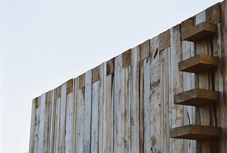
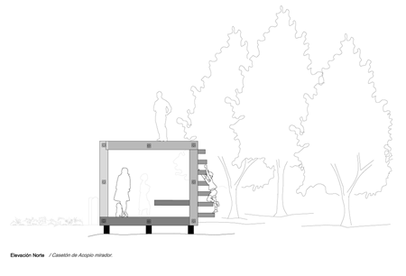
Beautiful observation Deck in Pinohuacho, Chile by Rodrigo Sheward. budget of $3000 and constructed from recycled wood using local labour. Used by hikers during the summer and hunters in the winter for a sheltered vantage and rest point.

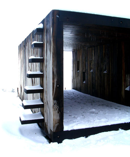
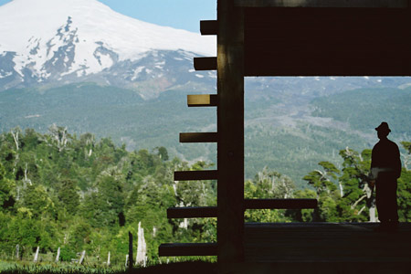
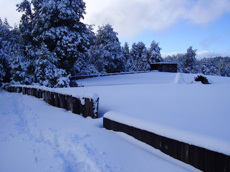
images via http://www.dezeen.com
images via http://www.dezeen.com
Friday, 17 February 2012

Thursday, 16 February 2012

Monday, 13 February 2012
via http://contemporarydesignandarchitecture.blogspot.com/ (click to see more images)


"THE INFOBOX - Scanned in from The Architectural Journal 05-06-08
THE INFOBOX WILL STAND WHILE 720 NEW HOMES ARE BUILT AROUND IT
ITS A TEMPORARY SALES SUITE ( EXPECTED TO STAND FOR 8 YRS ) THAT ACTS AS A BEACON FOR UBRAN SPLASH'S TRIBECA DEVELOPMENT AND ADVERTIZES THAT TRIBECA STANDS FOR QUALITY OF CONCEPT, USE + CONSTRUCTION.
WHAT THE DESIGN REQUIRED
- MAIN ENTRANCE TO ENTICE PEOPLE IN
- ENOUGH SPACE TO HOLD MEETINGS
- DISPLAY A LARGE SITE MODEL
- VIEWING AREA THAT ALLOW VISITORS TO WATCH THE BUILDING TAKE SHAPE "
Saturday, 11 February 2012
The Architecture of Fear


I've just started reading the-arch-of-fear a blog by a Columbia University Student. It may not look very snazzy (the graphics are pretty dull) but the blog itself is really interesting and at times a little haunting. Currently the writer is in Kabul. Definitely worth a read.
Friday, 10 February 2012

Thursday, 9 February 2012
smaller reading spaces
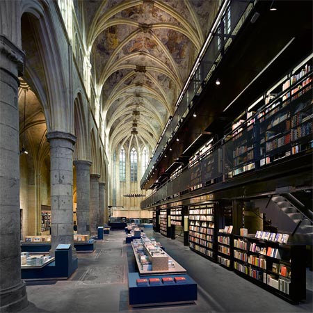

Dutch architects Merkx + Girod have won the Lensvelt de Architect Interior Prize 2007 for their Boekhandel Selexyz Dominicanen in Maastricht


Books are stored in long shelves along both sides of thebookshop. By this means a clear oragnization and a monumental effect is achieved. New titles and bestsellers are displayed at several mobile stands.

The permanent part of the program – storage, deposit, office and lavatory – are placed under the gallery and accessible via a staircase at the edge of the coffee bar and cascades.


Structural engineering: Geostat
Carpenter: Treeman
Total floor area: 170m²
Wednesday, 8 February 2012

Monday, 6 February 2012


Sunday, 5 February 2012

Saturday, 4 February 2012
Nice French Things; French New Wave, Jean Luc Godard, Anna Karina, Jean-Paul Belmondo
we all need a little French new wave in our lives (and I'm too lazy to put it on tumblr). Enjoy!


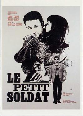


and some creepy czech new wave
Subscribe to:
Posts (Atom)