

Sunday, 30 January 2011
Friday, 28 January 2011
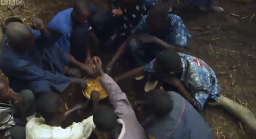
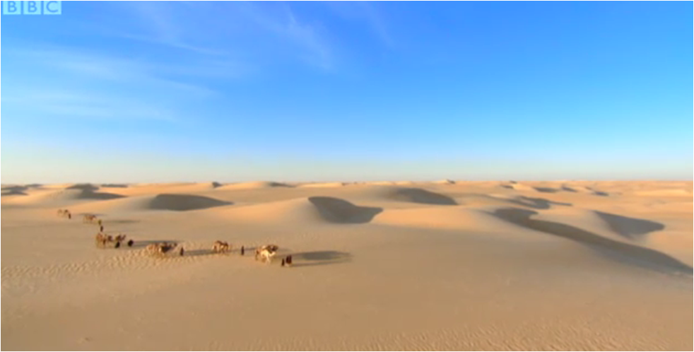
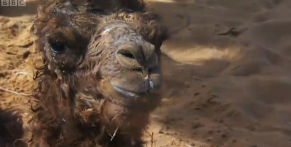
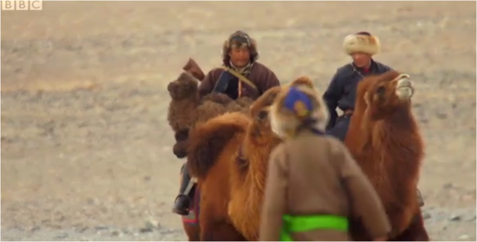
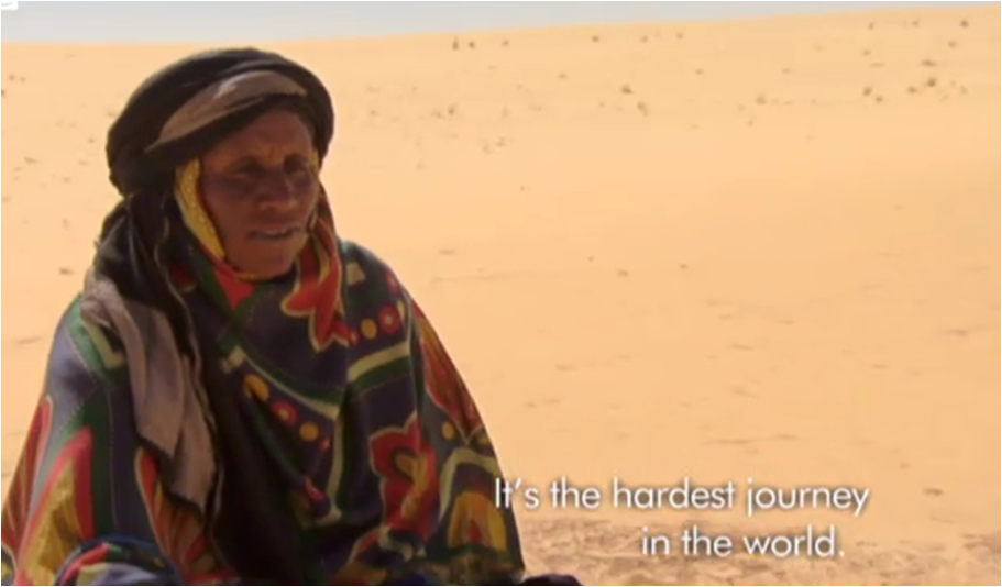

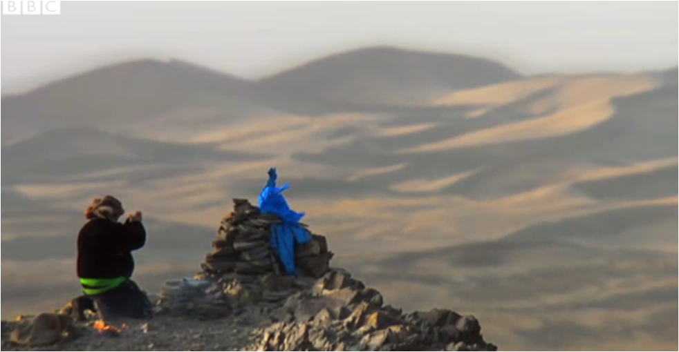
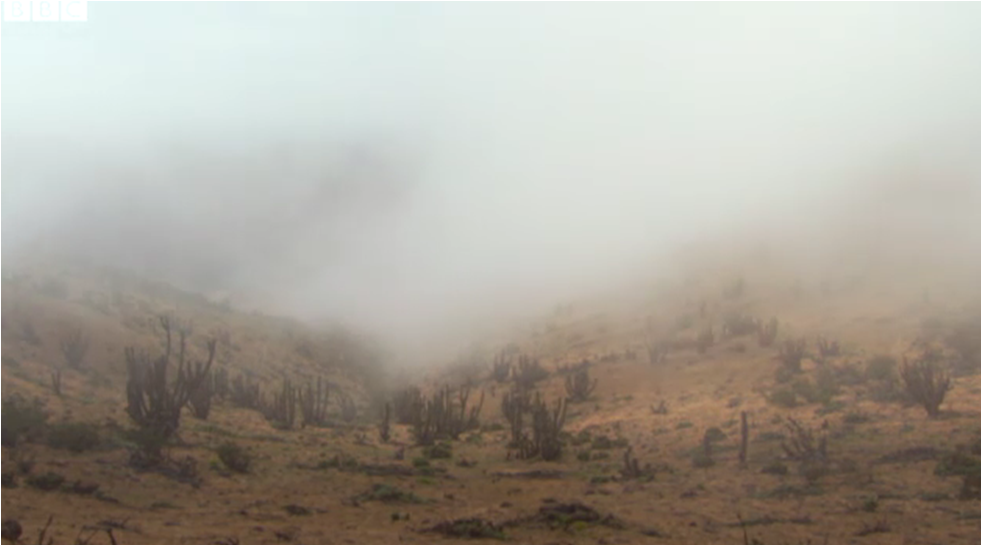
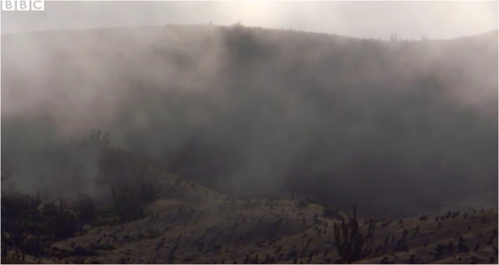
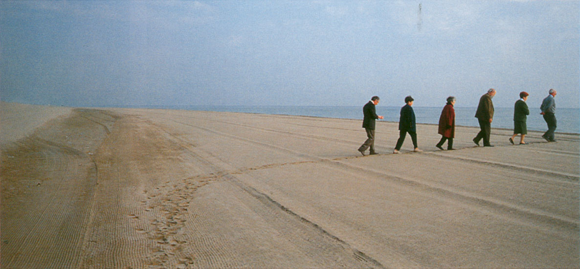
Finisterrae
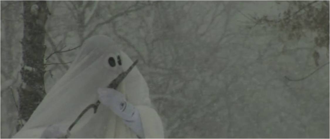
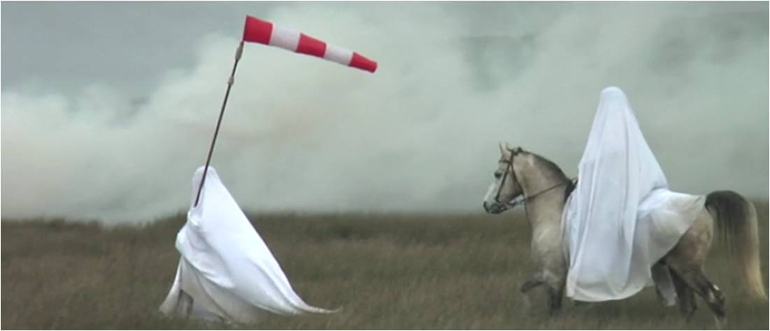
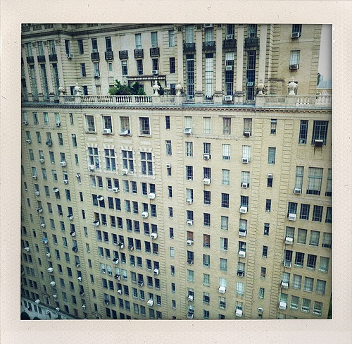
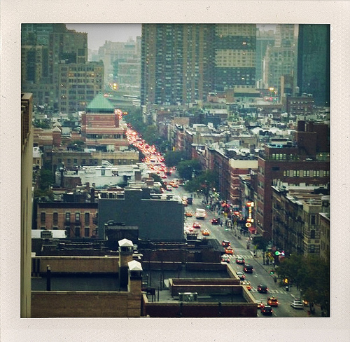
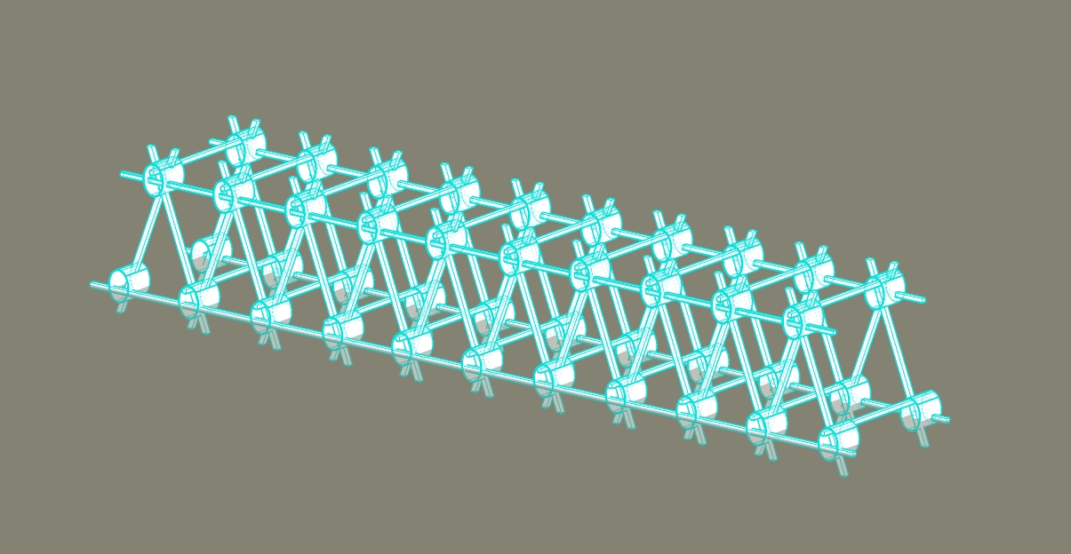
"Finisterrae tells the story of two ghosts who, tired of wandering through limbo, decide to take the Way of Saint James, to the end of the world so that once there, they may begin a new fleeting, earthly stage in the land of the living"
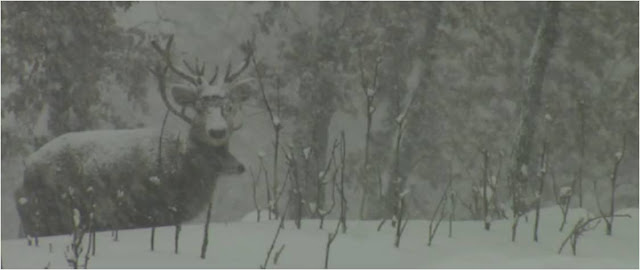
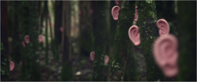
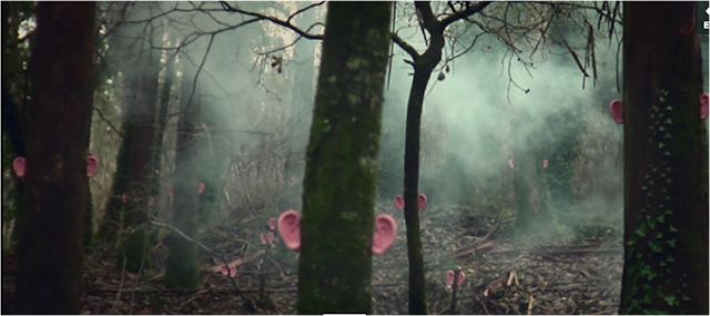
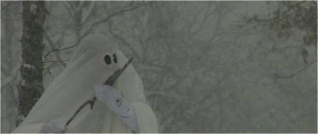
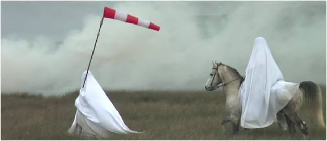

~this looks mad
http://2011.sonar.es/en/imatge-2010.php

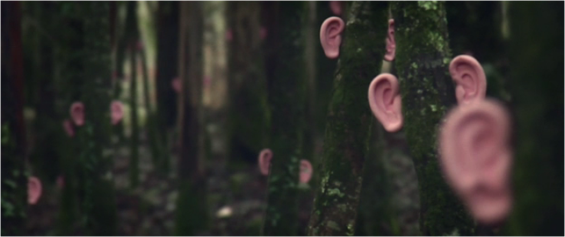
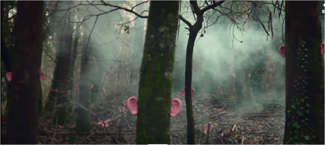
~this looks mad
http://2011.sonar.es/en/imatge-2010.php


Wednesday, 26 January 2011
Design
"Design is inherently an objective process, yet when it comes to designing for people, we tend to cloud this truth. As emotional beings, our judgment is often greatly affected by how we feel, and how we feel is often unpredictable, uncertain, and complicated.
Therefore, we can’t design for emotion; everyone experiences it differently"
Eric Fisher
http://fishofthebay.com/posts/objective-design#more-219
Therefore, we can’t design for emotion; everyone experiences it differently"
Eric Fisher
http://fishofthebay.com/posts/objective-design#more-219
Friday, 21 January 2011

Wednesday, 19 January 2011


ok, this is just beautiful
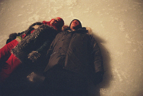
Good graphic design. Following a trend in cosmic washed out graphics. All the pictures look like photos drained from the light, like old polaroids and the font is bold but not invasive. It fits. I like it. I don't know the name for this style but I shall call it astroid laundary. http://firstmanintospace.tumblr.com/page/6


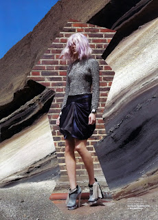
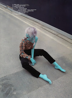



I remember first seeing this sort of style in an old edition of pop magazine. I can't find the exact editorial pictures but heres a few that depict a similar washed out feeling, nonchalence and underlying melancholy all hinged in the fact there is allot of drab colouring. These are collected from two seperate editorials. Spent! is very dear to me (the one with the yellowing old/young lady) and the other is just cosmicy. so enjoy. They arn't exactly the same thing but I can asssure you that somewhere in a 2009 ediiton of Pop there is a very spacey graphic and it works.
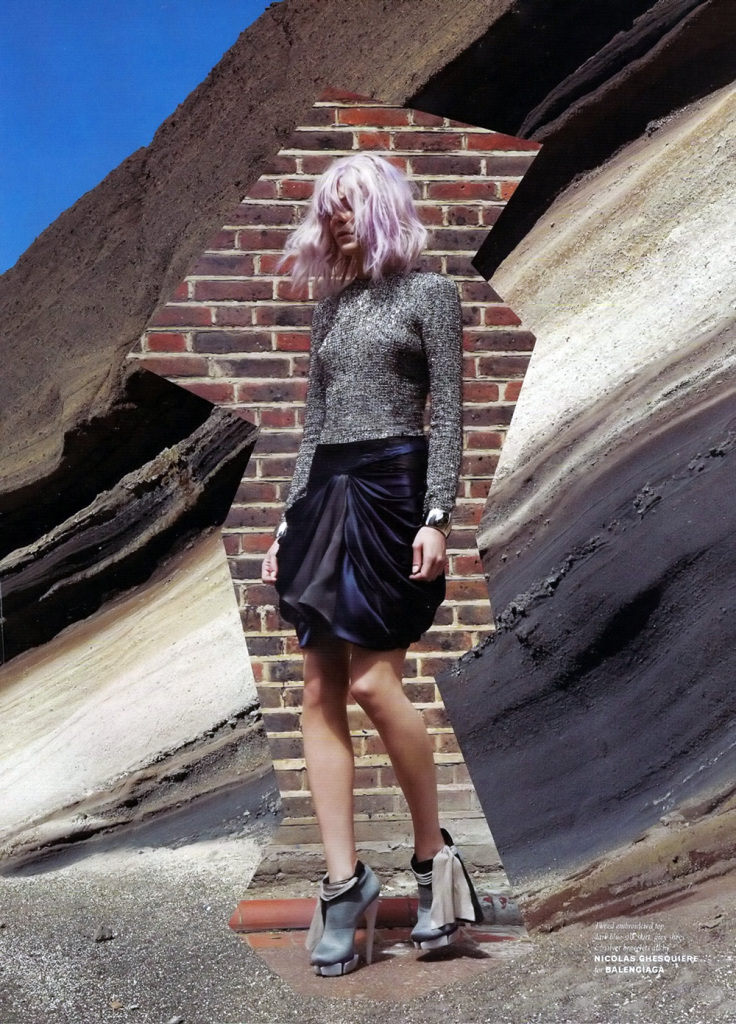
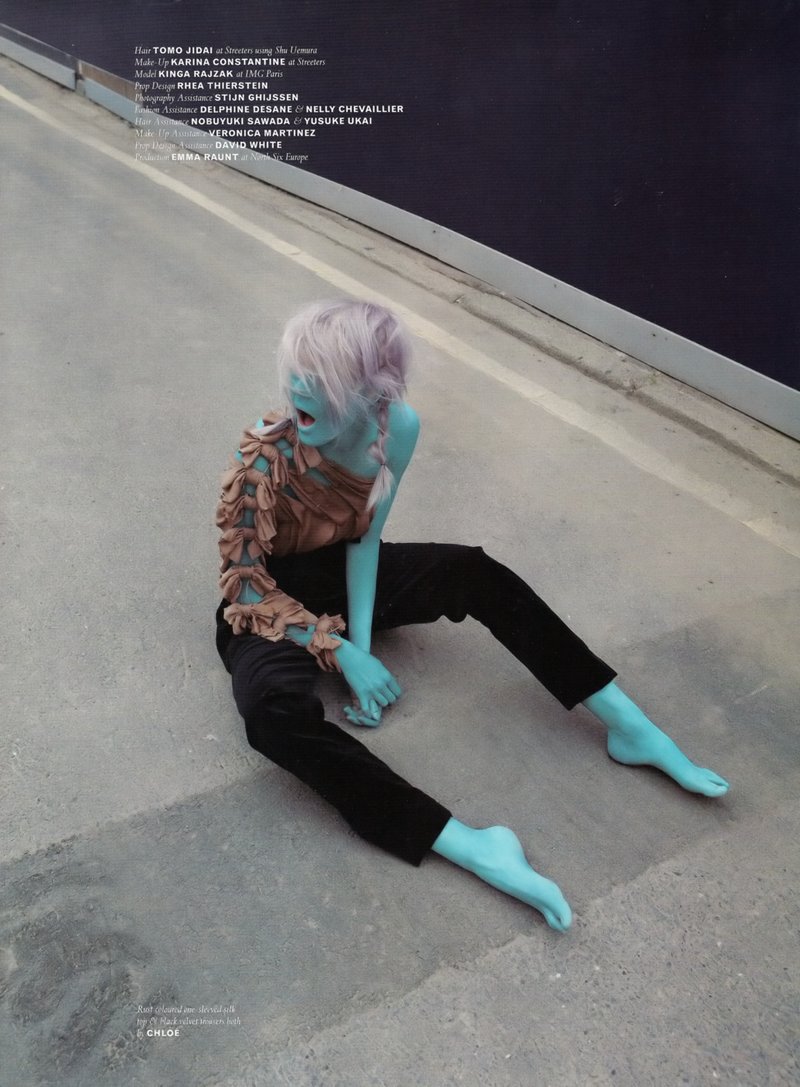

Pop, 2009
deathofanarchitect, illustrator
death of an architect, i want your website name.
http://deathofanarchitect.tumblr.com/page/2
There's some really good stuff on this tumblr. This is the kind of illustration I'd like to do. It's precise, colourful, fun and well composed. Not to mention architecturally related, making my post (for once) valid.


http://deathofanarchitect.tumblr.com/page/2
There's some really good stuff on this tumblr. This is the kind of illustration I'd like to do. It's precise, colourful, fun and well composed. Not to mention architecturally related, making my post (for once) valid.
death by architecture
I don't really understand this website (some competition thing for architects, therefore i switched off) but the headings pretay cool.
 see.

David Adjaye
Interesting public speaker. Offers an insight into how to speak about buildings in a fluent, poetic and imaginative way.
"A glomeration"
"polamic"
"entropic"
"florentine palaces"
"windows that locate you"
Tuesday, 18 January 2011

poster perfect

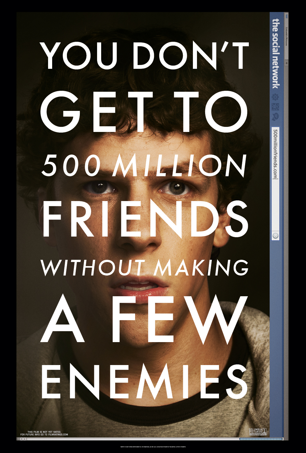
Thanks to my recent discovery that I'm crap at layout and design I've become quite intrigued with graphic design. In the hope that looking it up will help me I'm making a post encircled around this love.
So here they are. Need to find the artists though. Should probably point out that this blog isn't really public friendly. It's more of a scrapbook for me to keep hold of points of interest. But just in case there is an actual person reading this I would really like some help finding more posters. Specifically one of Collin Firth in which his face is overlayed with the phrase "God save the King" in the style of the social network poster.
obrigada.



Monday, 17 January 2011
Subscribe to:
Posts (Atom)