Sunday, 26 February 2012

I love museum architecture


photos via designboom
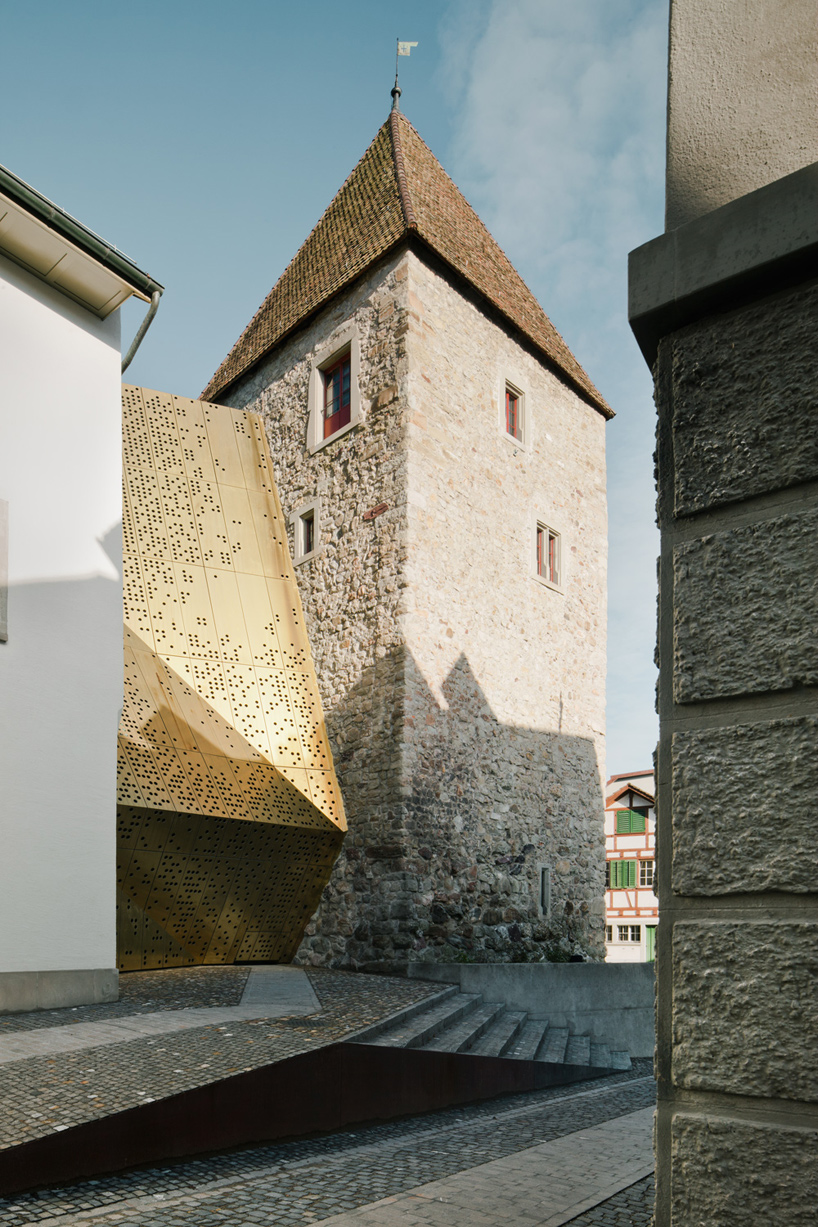
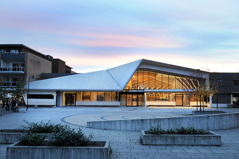
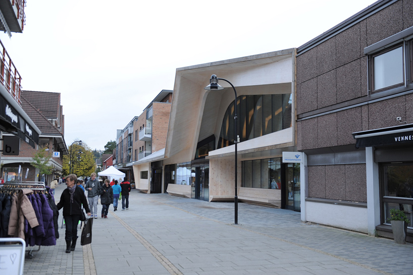
Museum Extension in Switzerland by MLZD architects.
I like how they talk about a more intuitive layout whilst using a clear public display. It's so pretty and not overtly dramatic or harsh, which it could've been with a reflective material and sharp angles. But the shallowness of the valleys and peaks means its almost soft, as well as the spattering of circles. noice. also like the cobbles.

Friday, 24 February 2012

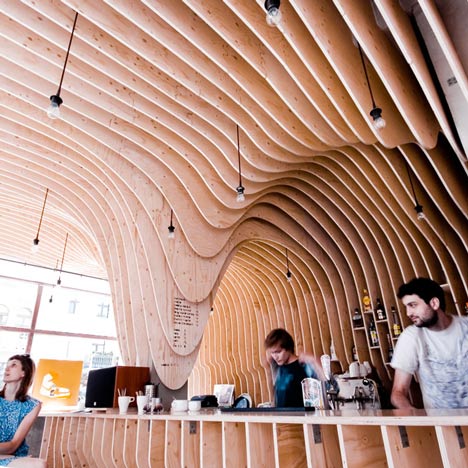
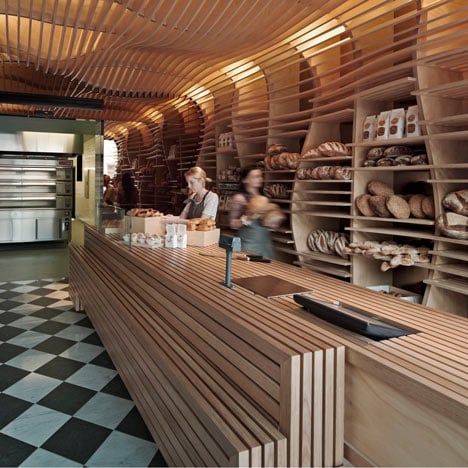
Make It about the Function; Zmianatematu cafe and Bakery

Zmianatematu by xm3
Baker D Chirico by March Studio
via dezeen. Both this bakery and Cafe take their product and use the main function of display to carry foward their complete aesthetic and material concept. I think its a gooda starting point and something I need to think about more in design. Could be really handy in producing consistent deisigns which don't feel like a box of parts.

Thursday, 23 February 2012

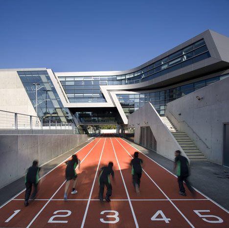
The Evelyn Grace Academy; Zaha Hadid


The brilliant Evelyn Grace Academy by Zaha Hadid. Brilliant example of simple, understated spaces for young people that works well in an urban space and is exciting at the same time. Yes I am lazy, so this is just the whole article from dezeen.
Evelyn Grace Academy by Zaha Hadid Architects
Zaha Hadid Architects have completed this school that bridges a running track in Brixton, south London.

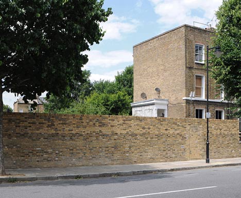
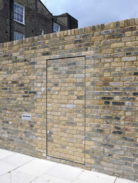
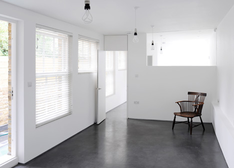
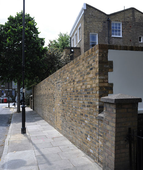
Wow; Old Workshop by Jack Wooley

read more at http://www.dezeen.com/2012/02/22/old-workshop-by-jack-woolley/#more-194258
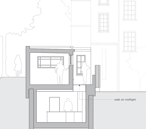
an almost compltly hidden door provides a 'secret' entrance to the inside of this two storey converted warehouse, with one storey submerged under the ground. A really interesting design and simple delivery. I really like this.
Old Workshop by Jack Woolley
Old Workshop by Jack WoolleyOld Workshop by Jack WoolleyOld Workshop by Jack WoolleyOld Workshop by Jack Woolley

Monday, 20 February 2012

I don't like David Hockney; or how i learned to tolerate him


(above) Hockney at his best

I don't like David Hockney. I find his work lazy and at times a bit clinical; a little bit soulless.
To me the collages are like cubism; uncomfortable pictures, with a lack of clear composition. The repeated squares from every photo created a rigid pixelated effect taking away any drama or contrast.  yes its very inventive, but I'm a bit mistrustful of inventive art and i'm also a bit mistrustful of collages, despite their whimsical charms. Inventive art is only inventive in the moment and it's not usually emotional. Worse though is the backlash of reproductions from other people, other people who appreciated the inventiveness but couldn't be bothered to invent anything themselves. Other people who are not David Hockey. I want these people to produce simple black and white photo with sharp contrasts and simple subjects then one of these again (see below) because I'm boring and I like standard photography.
An alright collage by hockney, for attempts google 'in style of david Hockney' and prepare for a mass of indifference

Sunday, 19 February 2012

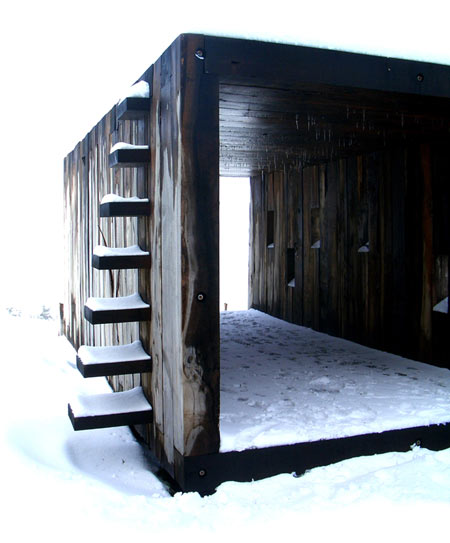
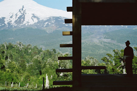
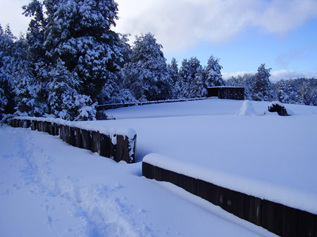
Pinohuacho Observation Deck

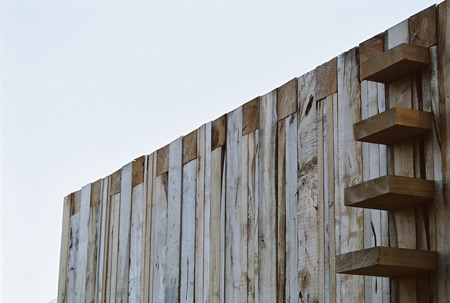
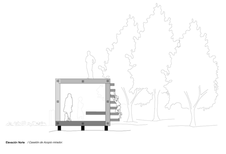
Beautiful observation Deck in Pinohuacho, Chile by Rodrigo Sheward. budget of $3000 and constructed from recycled wood using local labour. Used by hikers during the summer and hunters in the winter for a sheltered vantage and rest point.

pinohuacho-observation-deck-rodrigo-sheward-2.jpg
pinohuacho-observation-deck-rodrigo-sheward-18.jpgpinohuacho-observation-deck-macarena-avila-1.jpg
pinohuacho-observation-deck-rodrigo-sheward-17.jpg
pinohuacho-observation-deck-elevacionnortepinohuacho.gif
images via http://www.dezeen.com