Sunday, 7 August 2011

Paper Cuts and Furniture

via
Style Bubbles post on fashion designer Gallants work had some good examples of detailed paper and furniture craft resulting in the designers beautiful Dress09.

Chinese Paper Craft


Lotte Ringers silhouette  film Prince Achmed 1926


Saturday, 6 August 2011

1960s Streets in the Skys

via http://tristonrobinson.wordpress.com/
Robin Hood Gardens
"The Brutalist blueprint

In 1961, the ‘streets in the sky’ concept inspired the design of Sheffield’sPark Hill Estate. Park Hill was intended to provide local authority housing for thousands of people. At the time, Sheffield was a largely working class industrial city whose best days were behind it. Sheffield Council hoped that the estate would signal the rejuvenation of the city and to provide quality homes in a deprived area.
Park Hill’s problems quickly became apparent. It was intended to be a version of Le Corbusier’s UnitĂ© d’habitation but the estate allowed some of the worst aspects of urban life to remain. The structure was full of shadowy spots and escape routes and although it included shops, a school and a pub, it did not allow for any of the vibrancy or diversity that had evolved organically in the area over decades or even centuries."

Thursday, 4 August 2011

Replace Angles? Tubo Hotel by T3Arc

via http://ineedaguide.blogspot.com/
tubohotel by t3arc 1
tubohotel by t3arc 5I don't think I'd like this for too long as a room

Neon Posters

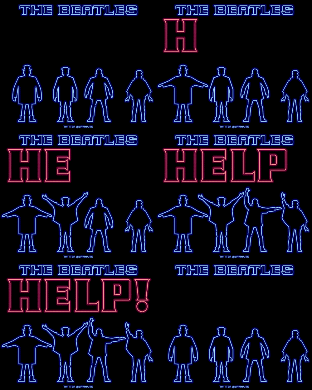
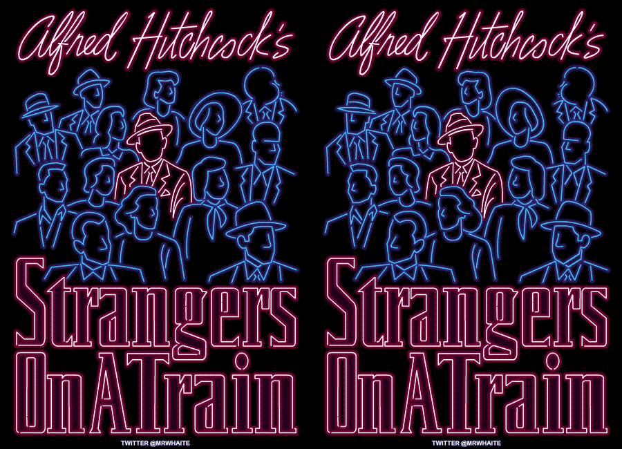
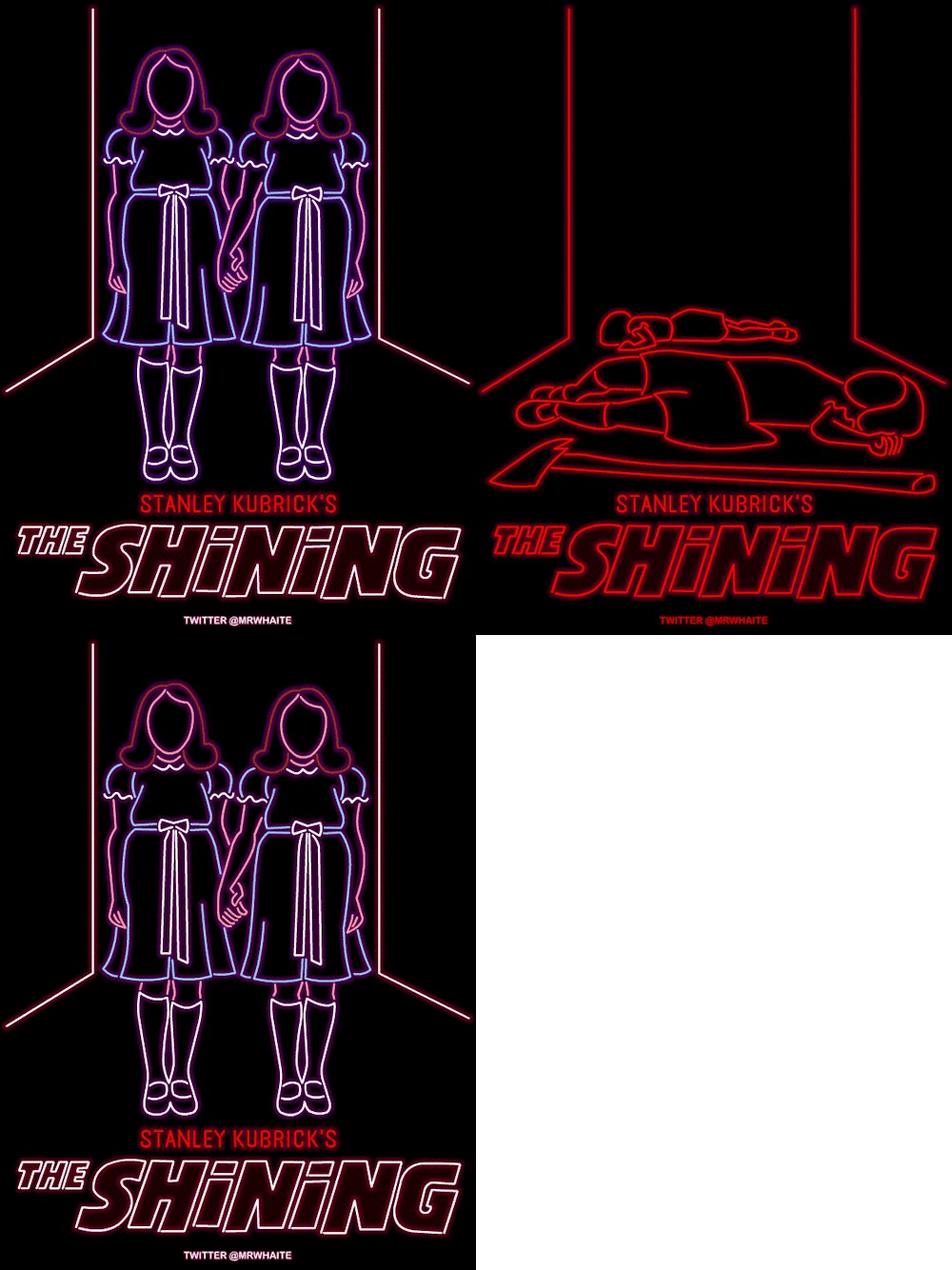
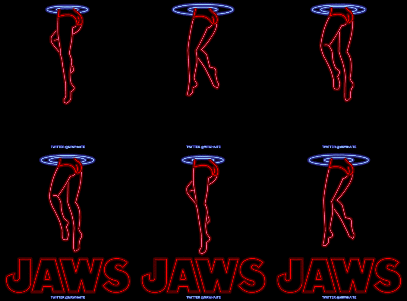
found this on taghrid.cc's blog. Neon film Poster's by Mr Whaite who explains;
"I love neon signs - they’re hypnotic, sexy, sleazy and tacky all at the same time - and I’ve always thought it would be cool if cinemas used them to advertise films. So with that in mind, I thought I’d have a go at designing some animated Movie "


A neon poster for HELP!
The semaphore actually spells NUJV! According to cover photographer Robert Freeman, “I had the idea of semaphore spelling out the letters HELP, but when we came to do the shot the arrangement of arms with those letters didn’t look good, so we decided to improvise and ended up with the best graphic positioning of the arms.”
It’s the Wimbledon finals this weekend, so I thought this would be a suitable neon poster to mark the occasion. It’s the creepy scene from Strangers on a Train where Guy Haines (Farley Granger) is being stalked by Robert Walker’s murderous Bruno.
At a tennis match the crowd watch the ball play back and forth while Bruno remains motionless, staring menacingly across the court at Guy.
A classic Hitchcock moment - can you spot him in the crowd?
A neon poster for The Shining.
Jaws was released 36 years ago today and I still won’t get back in the water.
For this design, I initially tried animating the classic Jaws poster with the swimmer and shark. Unfortunately it looked like the girl was swimming on the spot and the shark was chewing gum - not very menacing!
Instead, I’ve gone for a pair of shapely female legs treading water - it evokes a sleazy strip-club neon sign but with added danger. Also, the ripples are a neat link to the previous Spielberg neon poster, Jurassic Park. 
Is it a bird? Is it a plane? No, it’s Superman in neon.

Wednesday, 3 August 2011

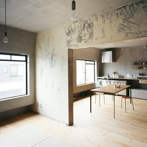
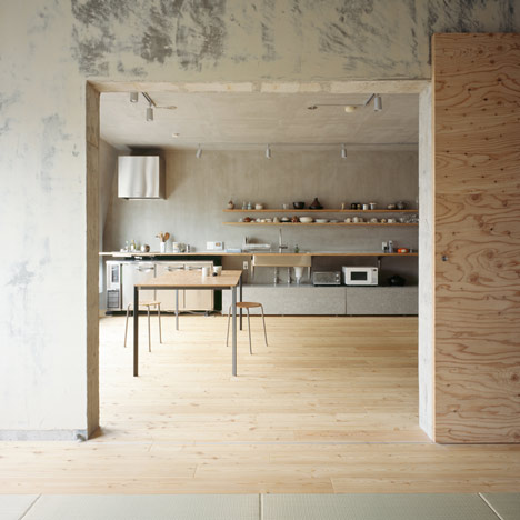
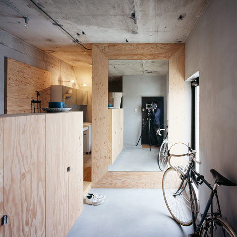
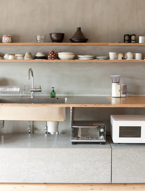
Exposed Walls; Setagaya Flat by Naruse Inokuma Architects and Café Coutume by Cut Architectures

via http://www.dezeen.com/2011/08/03/setagaya-flat-by-naruse-inokuma-architects/
Walls have a softly brushed look about them from the architects peeling off wallpaper and applying layers of cement and putty over the exposed cement.
Setagaya Flat by Naruse Inokuma Architects

Setagaya Flat by Naruse Inokuma Architects
Dezeen also pointed me in the direction of the exposed wall used on Cafe costume by Cut Architectures
Cafe Coutume by Cut Architectures


Sculpting Rooms; Lang/ Bauman

via http://ineedaguide.blogspot.com/
lang baumann 1
lang baumann 3lang baumann 4lang baumann 5lang baumann 6lang baumann 8

Self Build Almere

Almere is a self build location in the Netherlands where occupants can buy land and build a house for as little as £150,000 for 100m2 in the 600 plots available. As featured in Channel 4's the Secret Life of buildings, inhabitants were happy with how the opportunity "[gave] back a unique house. [and that] everything you like, you put in it".
With so many decisions though, the opportunity to let everyday people design their own homes, results in strange and sometimes awkward buildings. It made me think of the quote; The doctor can bury his mistakes, but an architect can only advise his clients to plant vines. Only there aren't any vines in Almere; the area's so desolate and the architects seem to be hidden away.
However, what it does show is in a basic form what people want, what they actually like and how imaginative they can be. A lot of people say to me I don't like modern buildings, but looking at the homes below it seems that some of the public at least do. I'm suprised at how happy people are to live in such unique and colourful houses but I still think they are all far too different to really be placed so close together. thoughts? 


screen shots from Channel 4's 'The Secret Life of buildings' broadcast on 1st August 2011


thatched house (interiors below) built by musician and girlfriend overlooking lake


Tuesday, 2 August 2011

sketch of the day #12

Found a statue of this man in the V&A today. Probably the most flamboyant and happy one I've ever seen (his frilly sleeved arm was raised high above his head midway dance, but sadly not sketched). He is also now my favourite and I shall name him George.

The Secret Life of Buildings

via Architecture Critic Tom Dyckhoff; my kind of presenter
I think as soon as I heard, "behold the pee pot of doom" in the shows intro, I knew that Tom Dyckhoff could surpass my own current love of Kevin McCloud as the omnipotent architectural power. This was then followed by him waving a flimsy childrens union jack with the kind of pout I only supply for the amusement of close friends and my puppy. More acts of wilful expression were soon to follow; I love this man.
The first argument in the show was between fufilment and artistic control. As an architect do you design to control your inhabitants or to fufil their basic needs? In fact this seemed to be central to the episode of home, and was very relevant and interesting.
Starting with light tests, Dyckhoff was taken from his "Santorpay", brightly lit living conditions to a more "gloomy", dimly lit one by editing the light conditions in his house. As expected his mood went down with his susceptibility to depression going up. What was interesting was the mass of evidence; Higher glucose level, higher tension and anxiety, vigor colapsed and an upset body clock; All very concerning.
Other things I learnt were;

  • The Golden Ratio more or less works
  • Beautiful surroundings numb pain
  • Materials are never an afterthough
  • UK developers are pure evil; something needs to be done
The show was really informative and probably more helpful then some lectures I've had. I think my next posts will probably be follow ups on research on topics and architects brought up in the show so keep an eye out for Ingles's work, the Golden Ratio, Amsterdam self builds and Maggi Centres. 
The Secret Life of Buildings: 9/10 for now, I'm sure it'll be a 10 by the end.

Graphic Design; National Rail Museum Posters

via http://www.creativereview.co.uk

"Leeds-based Thompson Brand Partners has created a new identity for the UK's National Rail Museum, the largest rail museum in the world."

"According to Thompson, "The new logo has been designed to reflect the direction the museum is moving in. It is modern, simple, easy to read and dynamic with a clear indication of speed and momentum. It is based on the many angled slashes that can be found in the iconography and architecture of railway throughout history. It also makes subtle reference to rails.""
"As well as the logo itself, new typefaces, colours and imagery will be applied across all uniforms, signage and so on at the main museum in York and its Shildon site in the coming months."

"The museum's previous logo recalled the bygone days of steam and great British railway companies with its three-dimensional lettering. While the new look lacks the charm of its predecessor (and may not look so great on merchandise), it's clean and simple and unlikely to date rapidly. It will probably invite criticism for being too obvious or "easy" a solution but, as opposed to some of the other museum identities we have seen in recent times, it is not trying too hard or making a conceptual promise that its execuition can't deliver. It's a museum about rail, past and future and the new mark does a fine job of conveying just that.
We haven't seen anything beyond the basic mark yet, so it's unfair to judge what the overall success of this identity might be. However, it may need some bold and imaginative applications to avoid seeming overly bland and corporate."