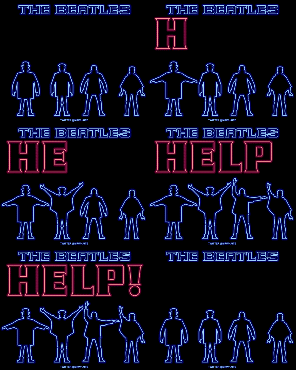
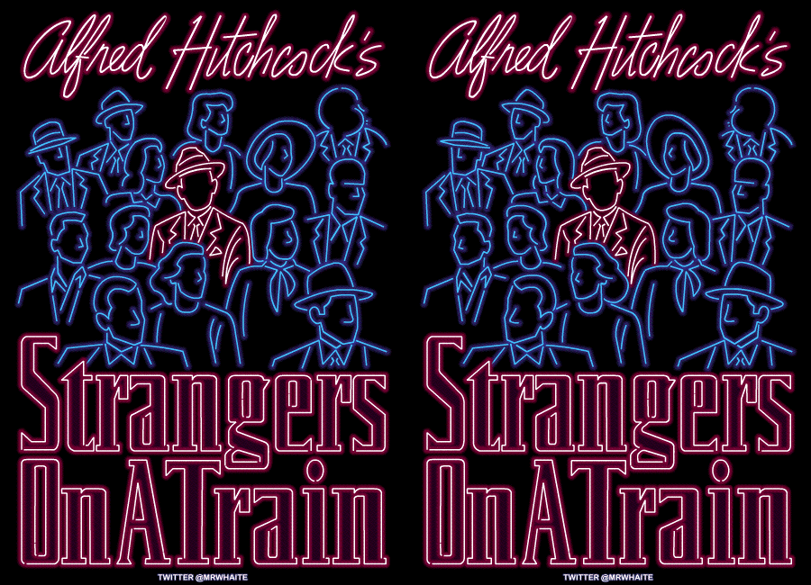
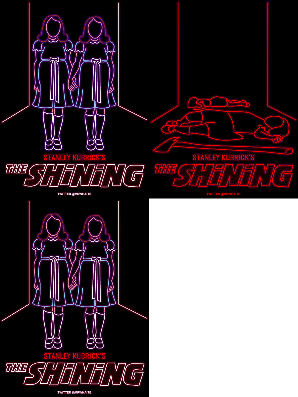
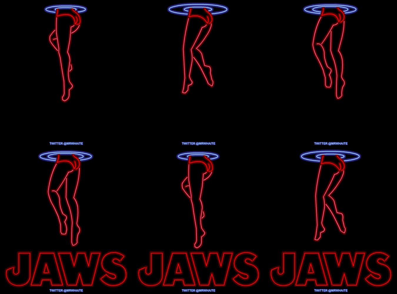
found this on taghrid.cc's blog. Neon film Poster's by Mr Whaite who explains; "I love neon signs - they’re hypnotic, sexy, sleazy and tacky all at the same time - and I’ve always thought it would be cool if cinemas used them to advertise films. So with that in mind, I thought I’d have a go at designing some animated Movie "
"Leeds-based Thompson Brand Partners has created a new identity for the UK's National Rail Museum, the largest rail museum in the world."
"According toThompson, "The new logo has been designed to reflect the direction the museum is moving in. It is modern, simple, easy to read and dynamic with a clear indication of speed and momentum. It is based on the many angled slashes that can be found in the iconography and architecture of railway throughout history. It also makes subtle reference to rails.""
"As well as the logo itself, new typefaces, colours and imagery will be applied across all uniforms, signage and so on at the main museum in York and its Shildon site in the coming months."
"The museum's previous logo recalled the bygone days of steam and great British railway companies with its three-dimensional lettering. While the new look lacks the charm of its predecessor (and may not look so great on merchandise), it's clean and simple and unlikely to date rapidly. It will probably invite criticism for being too obvious or "easy" a solution but, as opposed to some of the other museum identities we have seen in recent times, it is not trying too hard or making a conceptual promise that its execuition can't deliver. It's a museum about rail, past and future and the new mark does a fine job of conveying just that. We haven't seen anything beyond the basic mark yet, so it's unfair to judge what the overall success of this identity might be. However, it may need some bold and imaginative applications to avoid seeming overly bland and corporate."
After wikipedia-ing 'The skin I live in' (that new creepy Spanish Fim with Antonion Banderess, google it) I discovered that Pedro Almodóvar's films come with really good posters;