Lovely house in Shizuoka, japan for a young couple. The house centres around three courtyards within a small strip or building.
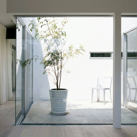


The house is only one storey but the windows come up and down at different heights.


Uses a timber structure.

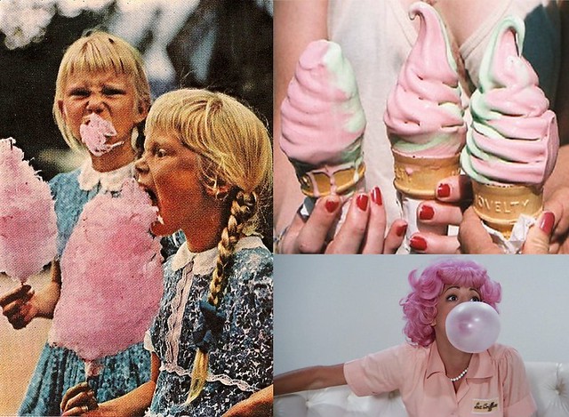
Yes, I'm still in love with Japanese houses, architects there just seem to do simple well. When trying to pin down what it actually is I like most I think it would be the softness of the materiality, colours, form and light working together. It seems very fashionable at the moment to convey a sort of softness in colour and form in all aspects of art. Everything is shaded in pastel yellows, pinks and greens. Looking back over the art I've had to research while studying I keep stumbling across examples like Cederic Buchet's Prada campaign;


Everything seems washed out, old and murky. Same with Jeff Walls work.


Painters I've used such as Jenny Saville also use this pastel pallet;


It's not just to do with the fact she's painting skin either. Her figures are constantly swabbed with strokes of paling bruises, not in always dark viscous reds but calming swirls of blue and pink. They also stand in front of sterile backgrounds of sky blue and white. The style is also loose and soft and the consistency thick and heavy.
For her though it's more sickly sweet then the melancholic moods of the two photographers.
Now that I keep up to date with design it (this style) also keeps popping up. Everything on designboom seems to be pale beechwood sanded down with rounded edges and finished off with a pop of inoffensive colour then photographed in front of the same pastille background as jenny saville and cederic buchet's .


I think other people my age are have fallen into step with it. Looking at stylerookie her posts are full of it;

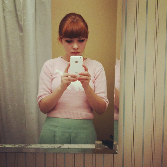
Even films joined in. Revolutionary road was packed with it


and I think this is mainly because designs is starting to revert very much back into a sort of well-mannered form, very much like the 1950's early 60's and away from the brash 90s and 80s. Or maybe I'm over thinking this.
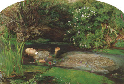
What I do know is that I think I might be falling out of love with it. Which is a shame since all of my paintings were kind of based around it, and I seemed to keep getting sucked in by it. But what I want now are some derivations. For the mean time I'll keep falling back on Japan when I need some easy inspiration. What I'd like to see though is some kind of pre-raphaelite period of colour, because whereas pastel is the one side of attractive colour in art, for me the other side is the rich, heavy tones of work like this;