
Good graphic design. Following a trend in cosmic washed out graphics. All the pictures look like photos drained from the light, like old polaroids and the font is bold but not invasive. It fits. I like it. I don't know the name for this style but I shall call it astroid laundary. http://firstmanintospace.tumblr.com/page/6


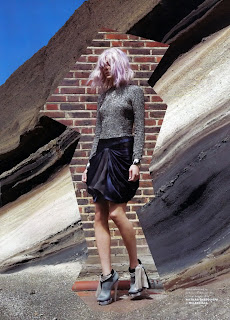

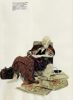


I remember first seeing this sort of style in an old edition of pop magazine. I can't find the exact editorial pictures but heres a few that depict a similar washed out feeling, nonchalence and underlying melancholy all hinged in the fact there is allot of drab colouring. These are collected from two seperate editorials. Spent! is very dear to me (the one with the yellowing old/young lady) and the other is just cosmicy. so enjoy. They arn't exactly the same thing but I can asssure you that somewhere in a 2009 ediiton of Pop there is a very spacey graphic and it works.



Pop, 2009
