Saturday, 14 January 2012

NB Studios


Lrf-poster

Zoom
Nb lrf_stationery_grey
Nb projects-066489
Wyndham l edit7
Universal posters 2
Nb projects-066527
Nb projects-066525

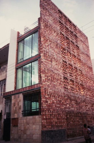
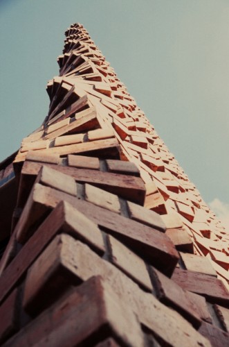
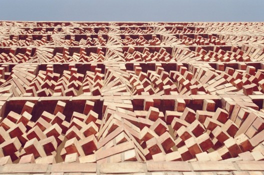
Beautiful brick


STREET CORNER
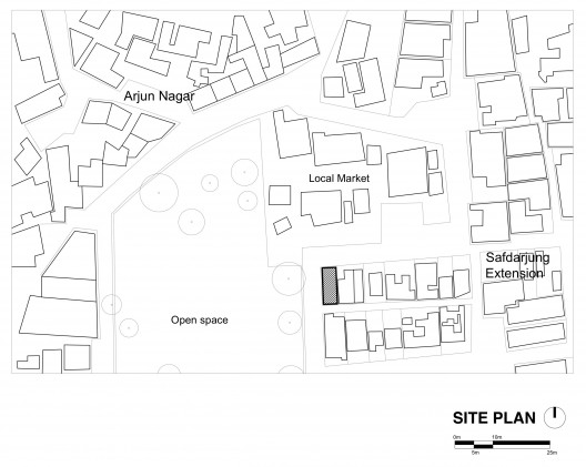
The site is at a busy street corner with essentially pedestrian traffic. As the site is not very large, the acoustic and visual intrusion of the street activity into work spaces was a key concern.
The method of construction adopted had to optimize the space available on site and a modest budget.
SOLAR THERMAL GAIN
The orientation of the site is such that the longer 10m side is exposed to direct sun throughout the day. Reducing the resulting solar thermal gain was an important design generator.

ENGAGING THE STREET 
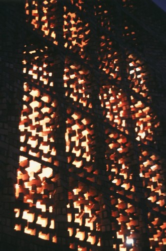
Although some fortification against the street was required, it was crucial for the façade “converse” with the external activity. The external wall is conceived as an animated, dynamic skin reflecting the bustle of the street and activating what would otherwise have been a mundane façade with minimal fenestrations. The porosity of the wall maintains a degree of privacy while playfully engaging with the street corner.
SPACE AND COST OPTIMISATION:
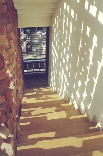
Efficient Space utilisation is achieved by creating a single consolidated volume on each floor to be flexibly partitioned as per the client’s requirements. This volume is serviced by a flanking buffer bay of a single flight cantilevered staircase and a toilet stack. Costs were minimised by using exposed brick construction and by creating a beamless soffit at every floor. To create a beamless soffit without increasing the thickness of the slab, a gently vaulting roof was designed. Lateral inverted beams were introduced and flooring laid onto an infill so that each floor plate insulated eliminating the need for a false ceiling.


more via http://bartlettyear1architecture.blogspot.com/search/label/brick

the secret lives of buildings 2 Work


finally found episode 2, so here's a new incoherent batch of notes;

Well to start off with, I really did need to find this episode for my work since I thought it would be relevant, and thankfully it was.'Work' focuses on offices and other places of work such as schools and factories, interestingly enough, workplaces within the home and artisan type businesses were excluded, but what was more important in this programme was the controlling powers from above and their influence on the tiny workers below. I get a strong sense of positive socialism in these programmes, a disdain for the capitalism of the post-modernist architects, and I like it.

Schools
so first up was the Kingsdale school in London Southwark:
school before
Kingsdale School Southwark
school after
The problem before had been unruly behaviour in the corridors due to lack of space. This was solved with clear, spacious mobility spaces, as embodied in the large covered space created in the old courtyard. Creating a much more pleasant and calmer environment for students.
Kingsdale School Southwark  Productivity also went up with expulsion down to 0 from 280 a year, and pupils gained on average 5 GCSE's. all from creating a space to be proud of. Details such as joints on big dome done to a human scale are small examples of an effort to create a much more rational space

office and foster
Willis building, Ipswich
Then they showed the Willis building. A building I've never liked in publications, but that could be due to the 70s haircuts in the photos and not the actual building. Turns out all the social spaces, such as the swimming pool and lobby all created a great place to work.
Willis building, Ipswich
then this happened:


Then it moved on to the gherkin, Norman Fosters other office building.
Only this time Dykkoff was angry, or just a bit baffled. Norman Foster, had failed him. What it lacked was the simplest of human touches. Foster tried to tell him "intuitively...you want to produce something beautiful" and used other beautiful analogies like 'pottery makes' which really did romanticise the whole architect thing but ultimately the large open plan spaces had been destroyed by the capitalist bastards de loittes who by the end of the episode we all come to hate.

Factories
Then Zaha Hadid suddenly redeemed herself from the last episode with the beautiful BMW factory in Leipzig;
BMW Leipzig
It was "stimulating, exciting" and best of all democratic.
BMW Leipzig
The most beautiful thing about it was probably the ingenuity to it all. Connecting the factory back to the offices is the production line floating above the whole workforces heads. Best of all the smell and sounds are almost unnoticeable and the sight of the products emphasises the whole idea of working together and moral; connecting everyone together. Later in the canteen, workers are also encouraged to eat together; it's all very modern, and very democratic.

office and the cure

Interpolis, Tilburg, Netherlands

Interpolis Tilburg The Netherlands


The Dutch architect gave workers different types of spaces for different types of work. Kind of like home and it was "really joyful". By this point Dykhoff was beaming.
Interpolis, Tilburg, Netherlands
The idea was you manage on trust. people do the work and come and show it after, kind of like home work. the architect explains "in the old system you think you can control everything and everybody but that's impossible".

Deloitte tries to copy this in the gherkin with the aid of an annoying psychologist.
"make it more homely, even add a house plant"
plants people have chosen themselves. this just ends up a little pitiful, sure its something but its not really enough and Fosters left having to deal with it, looking at how capitalism has ruined his beautiful building.


finally 
herman hertzberger's building in the Netherlands proves to be perfect
Central Beheer, Apeldoorn, The Netherlands

Friday, 13 January 2012

Home street home; Pyjama's outfit

via http://www.deconcrete.org/2010/04/23/street-sweet-home/


Don’t go outside wearing pyjamas, be a World Expo civilised person”
Apart from the largest metro extension ever built in the world and many new pedestrian-friendly public spaces, Shanghai will also inherit a social burden with the Expo 2010. Before Maoist period, two kinds of citizens used to wear pyjamas in the street: rich foreigners showing off their leisurely lifestyle and happy people to display their entertainment.
During communist times, the habit of wearing pyjamas broadened to everyone. Because of tiny dwellings, residents needed to expand their living environment to the outdoor space, and it was a simple practical matter not to change clothes just to go to the public toilet or to the nearby market. The whole city was conceived as one’s own living room.
However, authorities and some Shanghainese, seem to be ashamed of this peculiar habit of the city, and officially it was recently banned. Justin Guariglia documented this comfortable everyday lifestyle, just in case it does never come back after the civilising Expo. Luckily, local controls seem to be more worried about other issues than chasing clothing trends.

Thursday, 12 January 2012

deadly girl

all outfits from urbanoutfitters. kind of relaxed femme fatal, but not overtly sexy.


The Door

via http://www.deconcrete.org/2011/11/29/the-door/


"There is a circular hole in the wall, about 30-40 cm diameter and perforated at 1 metre above the ground. A man enters through the hole in the wall and a man (apparently the same individual) exits again through the

sketchbooks

It's been bothering me for a long while on how to approach this but these examples from booooooom seem inspiring and encouraging;
edward kinsella illustration illustrator sketch drawing
Edward Kinsella's works really expressive and experimental edwardkinsellaillustration.com/, especially like the Paris and Venice sketchbook.
drawings from artist James Jean
james-jean
70
sam vanallemeersch drawing artist sketchbook
70
70
Sam Vanallemeersch is brilliant http://www.sovchoz.be/
kenn goodall drawing sketch book

and ken gondall's pretty too


like francis vallejo too!